How to recreate this animated footer detail from Lóvi
4th Apr 2024・3 min read
What we want to recreate
The juicy lovi.care website has been doing the rounds recently on Design Twitter, and it’s easy to see why.
To introduce the product, they use a plethora of slick micro interactions that take you from ignorant to excited in seconds.
Don't like reading?
Check out the video version
Tucked away at the end of the page, after the impressive scroll/framer-motion driven animations have stolen your breath away, there is one more detail I’d like to focus on.
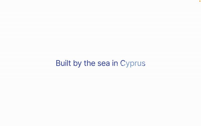
It’s Lóvi's take on the much-love “Made in…” tagline.
How they did it
At first glance, it looks like there might be some pretty complex CSS animations happening under the surface to create the rippling effect of the water.
But when we dig a little further, we find there’s very little complexity at work. The effect is created by an animated GIF clipped to the text.
Follow along and see just how easy it is to recreate.
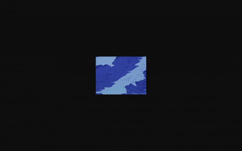
The animated GIF behind the text
How to recreate it
1) Start your HTML file
You don’t need any fancy frameworks to get this working, just spin up a HTML file in your favourite text editor and open the file in the browser.
We’ll start off by creating our HTML page complete with a body and the H1 title that we’re going to be styling.
Let’s mix things up a little by straying from the Lóvi example slightly. Where they build the product by the sea in Cyprus, let’s say our product is made in the desert in Morocco.
<html>
  <head>
  </head>
  <body>
    <h1>Made in the desert in Morocco</h1>
  </body>
</html>2) Add styles to body to center
This is a completely optional step but I like to centre the text in the page so we can see what we’re doing a little better.
Well go ahead and apply flexbox styling to `body` in order to center our `h1`.
<html>
  <head>
    <style>
      body {
        display: flex;
        align-items: center;
        justify-content: center;
      }
    </style>
  </head>
  <body>
    <h1>Made in the desert in Morocco</h1>
  </body>
</html>3) Add styles for the h1
No matter how good our animated GIF looks, if we rely on the default styling then it’ll probably still look bad.
Let’s add a few basic styles to get the text similar to that of Lóvi.
<html>
  <head>
    <style>
      body {
        display: flex;
        align-items: center;
        justify-content: center;
      }
      h1 {
        font-family: Inter;
        font-size: 24px;
        font-weight: 400;
        letter-spacing: -0.3px;
        margin: 0px;
        padding: 0px;
      }
    </style>
  </head>
  <body>
    <h1>Made in the desert in Morocco</h1>
  </body>
</html>4) Find a GIF
Time to find a suitable GIF for the background. Now, seeing as we’re going for the desert theme, I’ve gone for something that evokes the “heat” of the desert.
Feel free to find something that fits whatever theme it is that you’re going for.
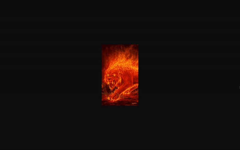
The GIF I selected to be used for this tutorial.
I used Tenor’s GIF search tool but please do note that other GIF searching tools are available.
<html>
  <head>
    <style>
      body {
        display: flex;
        align-items: center;
        justify-content: center;
      }
      h1 {
        font-family: Inter;
        font-size: 24px;
        font-weight: 400;
        letter-spacing: -0.3px;
        margin: 0px;
        padding: 0px;
        background-image: url(https://media1.tenor.com/m/liJ84fQBFgsAAAAC/shane-ford.gif);
      }
    </style>
  </head>
  <body>
    <h1>Made in the desert in Morocco</h1>
  </body>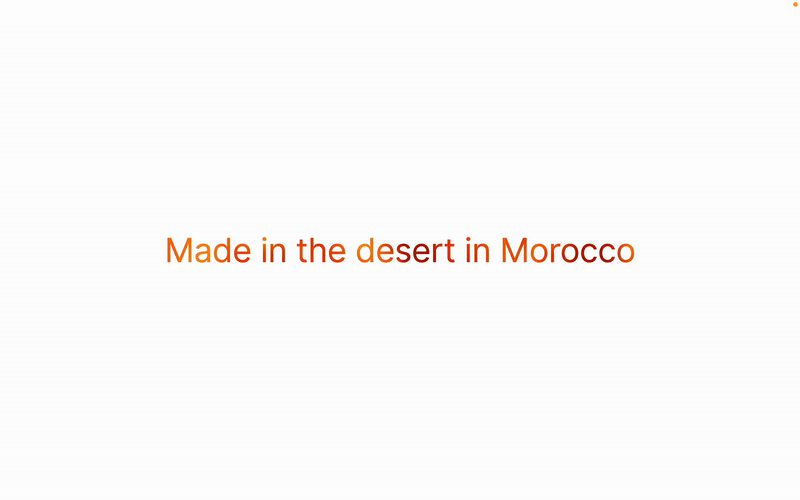
</html>5) Finishing touches
Now although at this point we have our GIF in place, we still need to clip it to the text to create that nice animated text effect that we’re going for.
You’ll probably have to play around with the background size and/or position before you get it right.
<html>
  <head>
    <style>
      body {
        display: flex;
        align-items: center;
        justify-content: center;
      }
      h1 {
        font-family: Inter;
        font-size: 24px;
        font-weight: 400;
        letter-spacing: -0.3px;
        margin: 0px;
        padding: 0px;
        background-image: url(https://media1.tenor.com/m/liJ84fQBFgsAAAAC/shane-ford.gif);
        background-size: 500%;
        background-repeat: no-repeat;
        background-position: 50% 40%;
        background-clip: text;
        -webkit-text-fill-color: transparent;
      }
    </style>
  </head>
  <body>
    <h1>Made in the desert in Morocco</h1>
  </body>
</html>End result
And voila—your animated text is complete!
If you do put this tutorial to use and want to put anything out there into the world, then hit me up on X at @butler952.
© 2025. Made in London.